Arrow Keys (for Keyboards Without Arrow Keys)

Do mechanical keyboards really need arrow keys?

Interesting idea showcased in this article from The Verge: an upcoming Angry Miao mechanical keyboard that adds a capacitive touchpad to use for arrow movement or other functions.

I use an ErgoDox EZ split keyboard that has no arrow keys. I find that placing the arrow keys on another layer works fine with practice. However, I still prefer to have arrow keys visible and easy to access. My preferred solution is to use a tiny SIXKEYBOARD placed to the left of my keyboard. The primary downside: this adds another cable to manage.

On the Manifesto for Ubiquitous Linking

The Manifesto for Ubiquitous Linking debuted at the end of 2021, but I just learned of it today. I’ll post the entire thing here, as the manifesto requires: “This declaration may be freely copied in any form, but only in its entirety, including this notice.”

We recognize that an immense amount of useful information is available digitally, and that tremendous value can be gained by connecting this information. Connected knowledge enables people to create great products, solve important problems and improve themselves.

We also recognize that humans work best in psychological flow. Switching contexts, even to search for information, interferes with flow while consuming precious mental capacity, brain energy and time. Activating an aptly-placed link to information is easier and faster than searching for the information — and more protective of flow.

We affirm that the ability to copy a link to a resource is as important for cognitive productivity as the ability to copy other types of information. This applies to all persistent digital information.

We invite software developers to do their part, by

  1. ensuring their users can conveniently obtain a link to the currently open or selected resource via a user interface; and
  1. providing an application programming interface (API) to obtain or construct a link to that resource (i.e., to get its address and name). To help people benefit from the information they process with software, we advocate ubiquitous support for linking of information resources. This would help realize the potential of hypermedia that was envisioned by information technology pioneers such as Ted Nelson and Douglas Englebart.

A good goal and, fortunately for me, most of the apps I use are link-friendly.

From Adam Engst of Tidbits:

Keep in mind, this is a manifesto, not a technology, standard, spec, or product. The Manifesto for Ubiquitous Linking is meant to encourage developers to add linking capabilities to their apps such that every distinct information resource within the app can be accessed via a link. And it encourages users who want to reap the cognitive benefits to request such support from the developers of the apps they use.

Well this is new to me and I love it: Music for Programming 🎶

Split Keyboard Base with Trackpad Rest

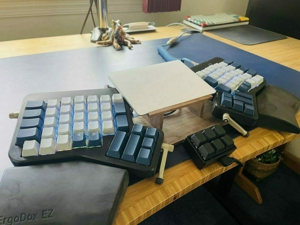
My new keyboard set-up:
C0832e647f

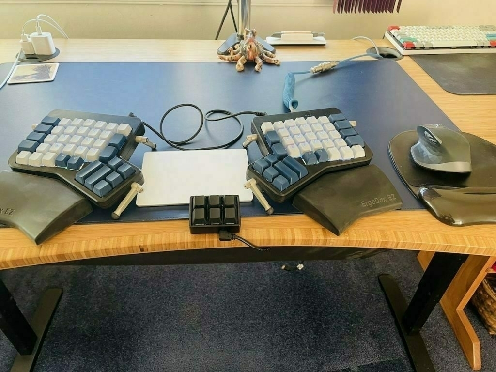
Here's a weird little project that took only a few hours and solved a unique problem. Here's what my computer keyboard set-up looked like before my project:
D8bf9746b2

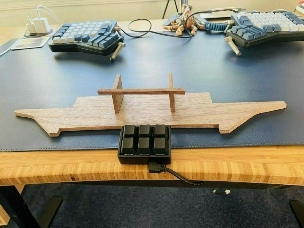
Backstory: I use an ErgoDox EZ split keyboard with an Apple trackpad in between (yes ... I use a trackpad and a mouse, for reasons). One problem: I'm pretty particular about my keyboard layout, so I like to have the angle of each side of the keyboard and the wrist rests just so. But each wrist rest and each keyboard half are free floating so they are always moving around. This is especially annoying when I need to move this stuff out of the way to clean underneath, or to use my secondary mechanical keyboard. Another problem: the trackpad in the center is too low, weirdly placed, and is just not great. So I came up with this odd thing:
2ab01a01c2

This was an interesting little challenge to create using hand tools. But it was worth the effort. Now when I need to move my rather elaborate keyboard set up out of the way to clean underneath, or when I want more desk space for a non-computer task, or to switch keyboards, I can quickly set things back up with the exact spacing and angling I want. I start by placing the wrist rests:
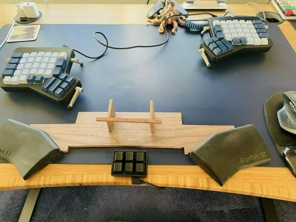
478afbdc0f

And then place each keyboard half against the wrist rests:
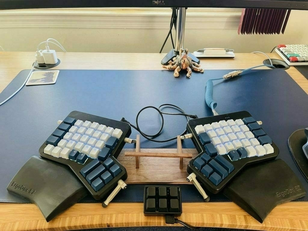
2b61e56ca5

And then place the trackpad on the raised, angled stand in the middle. The cable that connects the two keyboard parts tucks neatly under the trackpad. I wanted to keep this as minimalist as possible, so I made it so that the trackpad front edge rests on the stand, but it's angled so that the trackpad back edge rests perfectly on the keyboard edges. This is the minimal width to fit the trackpad and the spacing is just right (for me) for typing. It is very stable and feels solid.
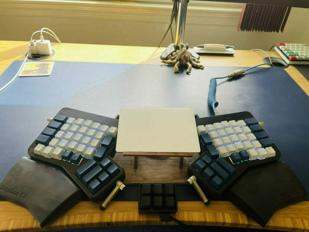
6ac1991e44

So I'm going to use this for a few days and make sure I like it, then I'll finalize everything, glue it up, give it a coat of Osmo. Based on a few hours of usage, I think this will be a good solution. Everything lines up just so and it just takes a few seconds to get all assembled. It also looks much neater.

Linux on an iPad

Pop! OS on an iPad

I recently "upgraded" an old 2009 Macbook Pro with Elementary OS, a fantastic Linux distribution. This led me down the distro hopping path, exploring way too many different Linux distros on my primary 2013 Macbook Pro using Parallels.

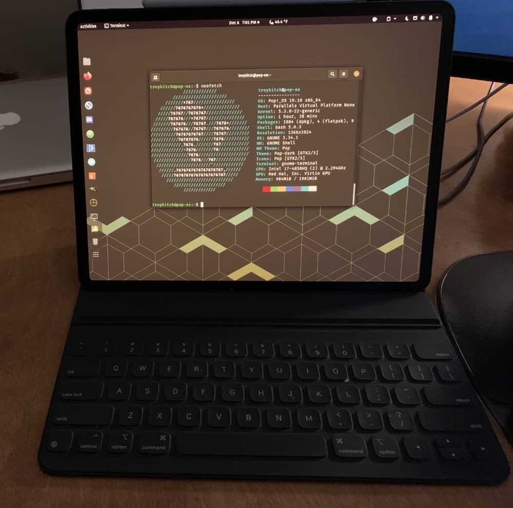
Then it occurred to me that to try out Linux on my iPad, just for kicks. Turns out it works great, provided you have a tool to run virtual machines and a Luna Display adapter. Above is a screenshot of my iPad displaying Pop! OS via my Macbook. Maybe this isn't the most useful thing in the world, but it's pretty cool to use my Apple pencil on Linux.

As an aside, my forays into Linux have been so enjoyable that I'm strongly considering switching to a System76 machine when my Macbook Pro kicks the bucket. I hope to hold out until System76 launches their first in-house designed laptops.

Ergodox EZ and Arrow Keys

I bought an Ergodox EZ Glow ergonomic mechanical keyboard in 2019 and I've grown to love it. It took me some time to adjust to a split keyboard, and even more time to nail down my personalized layout across three different programmed layers. The unmarked keys on the board did not take as much time to adjust to as I thought they would. I purchased the black model with Cherry MX Brown switches, and upgraded to Blue Zilent switches and gray/blue keycaps. Dreamy.

But after months of using this keyboard, there was one thing I could just not get used to: switching layers to get to the arrow keys. I never realized how often I use arrow keys until they weren't easily accessible. My solution was to get a tiny six key customizable keyboard from TechKeys. It fits perfectly in between the two keyboard halves. In addition to the arrow keys, I programmed the top left and right keys with an extra shift and space, because it's often quicker to tap the tiny board when arrowing around. I think it's an amazing set-up.

Now I just need to get some custom keycaps for the tiny board. I'm currently using leftover keys from my Vortex Race 3. Why two mechanical keyboards? I have a standing desk station and a sitting desk station. I use the Vortex while sitting, the Ergodox while standing. Excessive? Perhaps. But the Ergodox is not the easiest keyboard to move around, so this works for me. Plus ... I just love mechanical keyboards. It's a bit of an addiction.

Copying Unclutter Notes –> Bear App

In light of the new Ulysses subscription pricing, I’ve been testing out the Bear writing app for Mac to see if it meets my needs (it’s a lot cheaper for annual subscription). I like it. I’m also using the Unclutter app, from the makers of DaisyDisk.

With Unclutter, it’s really easy to create new notes on the fly. You just move your mouse up to the top of the menu bar, drag down, and you’re presented with a field to start typing in notes. I love this. It’s fast and I don’t need to first open an app. As an aside, Unclutter presents three panes: one holds clipboard items, one stores files, and one is for jotting down quick notes. It’s very handy. But this post is just about the notes pane, which I tend to use the majority of the time.

And the majority of the time, I’m typing in notes that I only need to maintain for a short time. Say, for instance, when I’m on a call and want to quickly log some notes. Those notes remain within Unclutter until I’m done with them, then I delete them.

But on occasion, I want a new note to be copied over to the Bear app. Bear is where I hold longer-term notes. Here’s a very easy way to do that using the Hazel, a brilliant Mac automation tool.

When I create a note in Unclutter that I want to save in Bear, I add a tag. In my case, I call it #.inbox/unclutter. In Bear tagging structure parlance, this means that I want this note to be in my inbox (#.inbox) with the sub-tag of unclutter. This works similar to traditional folders: the note will appear nested in my inbox tag. The ‘.’ in front of my inbox tag ensures that this frequently-accessed tag is sorted (alphabetically) near the top of my list of tags, which is handy since the “inbox” is always where I start when I fire up Bear. It’s where I store items to be further processed. So here’s a note I created in Unclutter (using markdown) with the ending tag: #.inbox/unclutter:

In Hazel, I created a rule to scan for texts in the Dropbox folder where Unclutter notes are stored. That rule searches for the tag: #.inbox/unclutter. When it sees that tag, it automatically copies the text note into Bear. Here’s what that rule looks like:

And once the Hazel rule runs, my new Unclutter note is copied into Bear.

Why do I want to do this? I’m generally using Unclutter as a really fast way to jot down notes. For most of those notes, I don’t want to save them for posterity. They’re just quick single entries for when I need to get some text down with no fuss, without needing to open an app. But sometimes I create a note with content that I intend to either build upon in the future, or want to copy/move to another text note housed within the Bear app. For those notes that I want to save for the longterm, I add just add the tag at the end and it’s waiting for me in Bear.

Fargo: Minimalist Browser-Based Outliner

fargo

I’ve just started using Fargo, a new browser-based outliner from Small Picture. This little tool is platform-independent and works within any modern browser (i.e. Chrome, Safari, Firefox, IE10). It’s an HTML5 app written with JavaScript. Files are stored in Dropbox in an open format (OPML).

Why use this instead of one of the myriad of other outliner tools on the market? It's simple to use. You don't need to install proprietary software. It's available anywhere you happen to need it. You don't need to worry about 'lock-in.' There's no need to export your files, ever. It's free. It works well. I like it.

On WriteRoom, Simplenote, and Plain Text Syncing

Simplenote subscription. 'Why not try something else out?,' I thought. It's not that I don't like Simplenote. It's great. But I've never tried anything else beyond Apple's paltry notes and the overpowered Evernote. Surely there are other worthy contendors out there.

What began as a simple search for an alternative snowballed into a larger project. I began by mulling over what is important to me when it comes to the note-taking (and note-retrieval) process. Ubiquity, certainly. I want my notes to be available anywhere, on any device. I want to be confident that the changes I've made to a note on my iPhone or on my Mac at work will sync back to my Mac at home. Simplicity, too. For all the praises of Evernote, I just can't use it without wincing. It's just so ... heavy. I need something light, like Simplenote.

Then there's format.  As a rule, I try to keep all of my important notes in plain text, stored in individual files. One reason for this is longevity. This is the one format that will always be accessible. Another reason is utility. Plain text may be cut and paste into just about any application. The final reason is portability. I store all of my important plain text documents (all of my documents, really) outside of databases, in individual files accessable through the Finder. File sizes are tiny, and I can move these files around and modify them with ease. So I want a tool that specializes in plain text.

What else? I also quite liked that I could email myself notes with the Simplenote premium service. I'd like to keep that ability. And I want to keep my notes synced with a lightweight desktop client. With Simplenote, I use the free Notational Velocity (actually, I'm using nvALT, a fork of NV with some extra capabilities). I'd like to keep using that. And I'd like to add one new thing that I've never tried: I want my notes to sync with my desktop file organizer, EagleFiler.

With all of these criteria in mind, two alternatives stuck out: WriteRoom ($5) and PlainText (free), both by Hog Bay Software. I tried both tools and settled on WriteRoom (even though PlainText meets most of my needs and looks great, it has no search capability. That's a deal-breaker). 

What follows is my solution for the syncing bit. This solution allows me to store all of my notes in one folder on my Mac. If I change a plain text file within EagleFiler, within nvALT, on my iPhone, or by directly editing one of my files via the Finder, the changes will be synced across-the-board.

You may wonder why I want my notes in both Notational Velocity and in EagleFiler. The answer is that it's more convenient and flexible. On the Mac, Notational Velocity is a speedy way to get to a note to modify it, or to quickly add or delete a note. EagleFiler (EF) is where all of my important documents reside, so I'm often using it (why switch to another program if I don't have to?). Added to this, EF is where I typically add metadata to my notes (flags, tags, etc.). And since all of my documents are in EagleFiler, I can perform more complex searches to easily locate, say, all notes and PDFs and other documents that contain certain keywords. Also, it's easier to move bits of text from my notes to other documents within EagleFiler.  

Here's how I set up syncing using WriteRoom, although a similar scheme works with slight modifications for Simplenote and PlainText. I'll get into some of those differences at the end.

Using WriteRoom

  1. The first step is to buy the iOS version of WriteRoom. Log in to WriteRoom using an existing Google ID (you can also chose to host your own sync service) and select 'Sync Automatically' from the apps Settings menu. Then head to simpletext.ws and log in, using the same Google ID. You can now sync your notes to this subscription-free online service.
  2. Now you’ll need to get the free SimpleText Mac client from Hog Bay Software and install that. This tiny app runs in the menubar. When you first run it, it creates a new folder in your Home folder called 'SimpleText.' Open the SimpleText app Preferences and choose to 'Start on Login' and 'Automatically Sync When Local Files Change.' Your text notes will now sync to the newly-created 'SimpleText' folder. Each note will be stored as an individual file.
  3. Next, you need to create a folder within EagleFiler. I called mine 'Sync.' Once created, you need to download and install a free app called 'MacDropAny.' This simple tool allows you to sync any folder on your Mac using Dropbox (Note: you need to be a Dropbox user to use MacDropAny).  When you run MacDropAny, you'll be asked to select a source and destination folder. The destination folder is that which you've just created within EagleFiler (you'll have to find it via the Finder). The Source is your 'SimpleText' folder where your notes are held.
  4. Now here's where you'll notice a problem. MacDropAny won't allow you to select an existing folder as your 'Source.' How do you get around this? Here's what I did. I temporarily copied my existing text files residing in the 'SimpleText' folder, then deleted that folder (you could also just move the folder to your desktop). Then I ran MacDropAny, choosing to create a folder called 'SimpleText' as my Source folder. After I did that, I copied back my notes (text files) to the 'SimpleText' folder. I know, it's a bit clumsy ... but it works.
  5. Next, head to Notational Velocity (or nvALT) Preferences and choose the 'Storage' tab. Choose to 'Store and read notes on disk as Plain Text Files.'  Then you need to choose the folder to store the files.  This is where you point to (you guessed it) the 'SimpleText' folder where all of your notes reside.
  6. Now test it out. Add some text to a file on your iPhone. The changes should appear within EagleFiler and within Notational Velocity. Change some text in EagleFiler or Notational Velocity. The changes should appear back on your iPhone.

EagleFiler Caveats

There are a few caveats about using EagleFiler. You're not really supposed to add files directly to file structure within Finder, but that's what I'm doing here. It works well enough, but it takes a little extra effort to keep it running smoothly.

EagleFiler uses a database to store metadata. An important part of that is monitoring any changes to files held within the app. If you delete a file on your iPhone, directly from the SimpleText folder, or from Notational Velocity, EagleFiler doesn't know what happend to that file. A similar thing happens if you change a file outside of EagleFiler, as the app monitors each files checksum to keep track of changes—I'm guessing many people don't even use this checksum feature, but it's there to ensure the integrity of your files.

So. Changing text in a note or adding new notes outside of EagleFiler isn't a big deal. You won't see any error messages unless you use checksum. If you do use checksum, you need to periodically update the checksums for the files you've changed (you're basically telling EagleFiler that the file is OK and that you've changed it from outside of the program). 

For files deleted outside of EF, you'll notice that EagleFiler retains the deleted file, but the contents of the file within EagleFiler now have no content. That's because the file isn't there anymore. To fix this, periodically run 'Scan for New Files' from the EagleFiler 'File' menu (Shift-Apple-R). EF will then show you all the files that cannot be found (as they've been deleted) so you can go in and clean them up from the list within the app. Once you delete them from the EF file structure, empty the trash. 

A few final notes about EagleFiler. The app creates new Rich Text Format documents by default. If you want to move an existing file that is in RTF to your EagleFiler sync folder, you'll first need to convert it to plain text. There's a handy script to do that. If you want to create a new note in your EF synced folder, hold down the 'Option' key while choosing the 'New RTF' button from the menu bar, and a new plain text file will instead be created (there is no 'New Plain Text' button option). I should also mention that the metadata you add to a note in EagleFiler stays (is only visible) in EagleFiler. Those tags, flags, etc., do not transfer to your externally-stored notes. However, this metadata does persist in EagleFiler, even if you modify a note outside of the program. 

While syncing plain text files to EagleFiler may sound difficult to maintain, it's really not bad. I think it's worth it. (I'm now waiting for the developer or other EF users to tell me that this is a terrible idea!)

Syncing with Simplenote, PlainText

You can use a similar process to sync files using the Simplenote and PlainText iOS apps. I tried them both out and the syncing worked just as well. Actually, these other apps were a bit easier to set up.

For PlainText, the main difference is that this app stores your notes using Dropbox (in a folder called 'PlainText).' Since the syncing is via Dropbox, you won't need the SimpleText Mac client. Note, though, that you also won't get the simpletext.ws online syncing.

For Simplenote, Notational Velocity includes built-in syncing support so it's a bit, um, simpler. And while Simplenote does not store notes in individual text files, you can accomplish the same thing via Notational Velocity. You just need to head to Preferences within NV and choose to store your notes as files on your local disk as plain text files. You can choose any folder you like. However, if you want to go the extra step of syncing with EagleFiler, you'll need to be a Dropbox user so you can take advantage of MacDropAny.  

Emailing plain text messages

The last point to talk about is how to add the ability to send messages from your email client to your notes folder.

With a Simplenote subscription, it's a straightforward task since this service provides you with an email address. There's nothing more to do.

With WriteRoom and PlainText, you need to bring in a couple of other tools. First, set up a free (donationware) service called, appropriately, Send to Dropbox. This service establishes a folder within your Dropbox called 'Attachments' and provides you with an email address to send your messages to. Note that this third-party service only stores your unique Dropbox ID, not your login/password (the same ID used when you share a file using your 'Public' dropbox). While the service is mainly for sending email attachments to your Dropbox via email, it works just as well for plain text. (As an aside, there are many other interesting Dropbox Addons worth checking out).

The trick, now, is how to get those plain text email messages from the Dropbox 'Attachments' folder to your synced notes folder. I used Hazel to accomplish this, establishing a rule to move any text file in the 'Attachments' folder to my 'SimpleText' folder.

That's it

The text for this post was harder to pull together than the syncing scheme. I spent a lot of time discussing EagleFiler. Even if you don't use this particular app, hopefully you'll get some new ideas about syncing folders. And if you've never used Notational Velocity, it's worth trying out. It's free, after all. NV is very easy to configure and is a great way to access your notes on your Mac.

How does WriteRoom stack up against Simplenote? It's still a bit early for me to say. One thing I know I don't like: the app is requiring me to log in every time I open it. I hope this is fixed in a future release. It wouldn't be that big of a deal if I had a newer iPhone with iOS 4. With my old phone, however, I can't run apps in the background.

As for looks, you can set up WriteRoom for iPhone to look quite similar to Simplenote. I prefer the default WriteRoom black background with white text.  One nice touch that WriteRoom offers, akin to its big brother on the Mac, is the ability to edit notes in full-screen mode. 

The WriteRoom web version of your notes looks like an old-old-school Mac text editor. Some may find that fun and retro, but it may be offputting if you're expecting a slick interface like that served up by Simplenote. Me? I rarely used the Simplenote online service, and I doubt I'll be logging into writeroom.ws very often.

If you like tags in Simplenote, you'll be missing that in WriteRoom. There are ways you can tag, though. I use the same work-around that I used in 'pre-tag' Simplenote—by creating tags with text at the end of my documents (using the syntax &tag: e.g. &home, &web). It works well enough for searching through many notes.  

Since I gave Simplenote a year, I plan to stick with WriteRoom for the next year. 

Dropbox 1.0

The best online file synching service is now out of Beta. Dropbox 1.0 offers selective folder synchronization (hooray!), an easier installation process, improved performance, and a slew of bug fixes.  If you're not on Dropbox, why not? The first 250MB of storage space is free. And if you get new people to sign up to the service, you get an additional 250MB of free space per person. Speaking of which, if you're new to Dropbox ... why not use this referral link to sign up. He he.


On ‘Distraction-Free’ Writing Environments

Oh, for a distraction-free environment. Wouldn't we get so much done?

I was combing through a backlog of unread feed items the other day, when I came across a parody from Merlin Mann in which he pokes fun at the current glut of non-distracting writing tools on the market. He serves up a fictitious new tool called ū—, a writing environment that's so minimalistic that it displays only the top-half of your typed words. Funny stuff, but what's the message here?

We know his intent, thanks to a follow-up in which he elaborates at great length on the original parody. It's an interesting read, albeit a long-winded rant (his self-diagnosis, with which I agree). While I found it a bit hard to get through this post, I was intrigued by the subject matter.

The essential point that Mann makes is that distraction-free tools can be distractions in themselves. They will not make you a prolific, competent, energized person churning out chapters of engaging prose, nor will they make you a productivity guru. If you find yourself seeking out tool after tool with which to make yourself a more productive and focused writer, perhaps the problem is that you're expecting the tool to do the work for you. In contrast, if you're really motivated to write, you'll write on tree bark if necessary. The same principle applies to any other endeavor, digital or analog.

So on one hand, Mann is criticizing the overblown language and suspect promises that sometimes accompany these types of tools. On the other, he serves up disdain for the type of person who collects such tools in a flailing attempt to fix an underlying concentration problem.

What I'm interested in is this: why does the 'distraction-free' tool genre exist in the first place. Perhaps it's a reaction to how we're choosing to live our lives. Most of us feel the drag of information overload, the weight of too much clutter, the barrage of too many activities. Much of this is self-inflicted. When we work on a task, we too often monitor e-mails, Twitter and Facebook accounts, phone calls, and text messages. These distractions hamper our ability to concentrate on single tasks for extended periods of time. We think we can multitask, but we most of us really can't.

Now, we all know that the only way to write in a concentrated manner is to muster the willpower to focus on one task to the exclusion of all others. That's what concentration is all about. It requires no special tools. It does not require a full-screen mode, nor pleasant imagery, nor ambient sound. True enough. But we like this stuff. As a society, we seem to have a tendency to look for tools or plans or guides to help us muster the self-control we seek. While we know that a tool cannot solve our concentration problem, that doesn't stop us from seeking tools that do just that. So here's one view on this current fad: the genre exists because there is a growing demand for environments that simulate concentration. We're seeking a concentration prosthetic.

Another view is that the 'distraction-free' tool genre is a reaction to the bloated, overpowered software that most of us have used for years. What do we need to write, after all? Not very much. What is most like a blank piece of paper? A blank piece of paper. What about a blank piece of paper with subtle background imagery and gentle sound effects? Why not. Distraction-reducing writing tools provide an uncrowded, narrowly-focused experience that just may spur us to concentrate a bit more. There's nothing wrong with that. If this alternate view seems like a slightly different take on the first, that's because it is. As I said, it's all about degrees of expectation.

The point is that distraction-reducing writing tools can only do so much, but that's not to say that they are useless. Why not try a writing tool that is pleasant, simple, and relatively inexpensive? We routinely choose analog tools based on preferences that balance form and functionality. We create our living spaces in much the same way. And so we are now offered a wide range of tools in the digital space for the task of writing.

So I say embrace this trend. Experiment. But try to do so with minimal expectations. And always remember that the 'map is not the territory.' Personally, I enjoy so-called 'distraction-reducing' writing tools. I use a few for specific tasks. I find that WriteRoom, for instance, is a wonderful tool for writing long documents. I like the looks of it. It reminds me of writing on WordPerfect on the first computer I ever used back in the 80s. OmmWriter? It's a bit over-the-top, but I can customize it to suit me. At times I find it to be a very pleasant environment in which to write poetry or short stories. What I enjoy about these tools is less about reducing distractions and more about aesthetics.

I didn't take Mann's parody or his meta-post about the parody as a condemnation of such tools. His broader message has little to do with software. It's about how we work, or should. The best part is at the end:

"Learn your real math, and any slide rule will suffice. Try, make, and do until you quit noticing the tools, and if you still think you need new tools, go try, make, and do more."

I like the 'quit noticing the tools' part the best. That's what we're striving for.

Useful Little Tools

Over the past few months, a slew of interesting little tools made the rounds in various tech blogs. I thought I’d compile some of the more interesting ones here (and add a few of my personal favorites):


f.lux


This free tool auto-adjusts the color temperature of your display(s) to match the time of day and your lighting source. The night mode is much easier on the eyes. Very pleasant. It can be temporarily disabled for those times when you’re engaged in a design project and need full color.

Alternative: Nocturne (from the developer of QuickSilver) offers ‘night vision mode for your Mac.’ It’s not nearly as subtle and elegant as f.lux, but you can adjust the settings to your liking. It’s especially great if you like it really dark when you’re computing at night…or if you like funky, inverted color schemes.

Cinch


The answer to Windows 7 ‘Snap’ feature, this $7 tool allows you to instantly resize any open window by dragging it to an edge of your screen. It’s particularly great for managing multiple Finder windows on a small laptop screen. I use PathFinder (which offers dual pane and tabbed browsing to the Finder) and don’t really feel that I have a need for this, but it’s a great tool nonetheless.

Readability


This is the only way to read articles on the Web. It removes all the extra formatting, ads, buttons, colors, and other clutter that surrounds a typical Web-based article, leaving only the text you want to read.

I use Readability for articles I want to read now, and Instapaper for articles I want to read later on my iPhone (using the Instapaper Pro iPhone app).

Choosy


If you’re like me and have many installed browsers, this $12 tool is a necessity. It allows you to choose which browser to use when opening an external link or when opening up an HTML file. You can also add other apps to the list. I have Choosy set to prompt me with a pop-up list of all browsers (prioritized with my favorites appearing first in the list), regardless of whether or not the browsers are running. I’ve also added MacRabbit’s Espresso as a ‘browser’ to send HTML files direct to this web development tool.

Alternative: I haven’t tried this one, but you may also want to check out Highbrow.

OmmWriter


A unique tool that’s still in Beta (so it’s free to try), Ommwriter delivers a full-screen, clutter-free writing environment. This app focuses on setting the mood to foster a creative spirit, offering several nice fonts, a choice of ethereal background sounds, and a variety of subtle keyboard clicking noises that I find annoying (the sounds can be turned off).

I still prefer the retro simplicity of WriteRoom from Hog Bay Software when I need to focus on writing. I use it in combination with Hog Bay’s QuickCursor, a wonderful little tool that allows me to edit text from other applications with WriteRoom.

Rapportive


Rapportive replaces the ads you normally see in the right-hand sidebar of Gmail with useful information: a profile of the person you’re emailing. It only works in Firefox and Chrome right now, but I use it via Mailplane (available in the latest preview).

As an aside, if you use Mailplane, you may like the beautifully minimalist Helvetimail style sheet.

SecondBar


This tool places an Apple menu bar on your second monitor. I use it. It works well enough, providing basic menu bar functionality on the extra monitor. It’s quite nice to have the bar on both screens, although it doesn’t work with all apps (that’s because it’s still in early Beta). It’s currently free.

Quix


Quix is an extensible bookmarklet, billed as ‘command line for your browser.’ While it takes some time to learn the commands to use with this tool, it’s worth the effort. I love it.

Skitch


This tool is certainly not new, but it stands apart as the easiest way to capture and mark up screen shots. I use it all the time and will gladly purchase it if and when it ever comes out of Beta.

Feedly


I use Google Reader to manage my feeds, but don’t really like to read feeds with it. Instead, I use Feedly. The more I use this free online service, the more I like it. On my iPhone, I use Byline. Since both tools use the same Google Reader account, my feeds are always synced no matter where I choose to peruse them.

Notational Velocity


In case you haven’t heard, the venerable Notational Velocity is back. This free tool is a simple, minimalist note taking app that is lightning fast. It syncs with Simplenote on the iPhone. It’s still in Beta, but it’s performed flawlessly for me so far.

Before I started using NV again (I had used it many years ago), I was using another great tool called Justnotes (which is currently free and also syncs with Simplenote). It feels a bit heavier and is a touch slower than NV, but it’s still in early Beta. It’s certainly worth checking out. Which one you prefer may come down to your personal design tastes. There is one important difference, though, that may help you make a choice: Justnotes installs in the menu bar, while NV resides in the Dock.

Together review

Together.

In preparation for this review, I perused forum comments and other reviews about this product. Many people, it seems, feel that Together is a lot like Yojimbo. That's certainly true. However, one could also argue that it's very similar to EagleFiler. The truth is in the middle, as is so often the case. Together marries some of the best features of EagleFiler and Yojimbo. But it also stands apart by offering the slickest interface I've seen so far. It's polished and fast, and a real pleasure to use.

What it looks like


Together's structure and filing system is similar to that of iTunes, as is the case with many Mac apps (particularly in this genre). It serves up your basic three-pane structure. In the lefthand-column source list, you'll find your Library (which contains all items that you've imported).

The Library is broken down into subcategories that are pre-defined by Together, such as notes, documents, images, and videos. These are smart groups, meaning that they are automatically populated with items you've added to your Library (sorted by file type). While you can't modify these 'standard' groups, you can delete them if you want. You can get the deleted standard group back later if you change your mind by selecting 'View Options' from the menu bar.

Under the pre-set groups lie user-defined groups, which may contain smart folders, regular folders, or groups. Groups are like playlists in iTunes. Smart folders contain items that meet your selected search criteria. Folders are just plain old folders. It all works as expected. Notably, the app offers the ability to nest folders if you're the type who likes to organize files in this fashion. Like Yojimbo, and unlike EagleFiler, each folders/groups show the number of items within each container, which is a nice visual cue.

Also similar to other apps we've looked at, selecting one group (or folder) from the source list presents you with a list in the righthand-column of all items that are in that group. Selecting one of these items presents a preview of the item. There are a couple of design choices, though, that make Together different from the other apps I've looked at. First, you can choose landscape mode, which is visually outstanding and particularly nice for wide screen monitors). Second, the 'Info View' (the place where you add metadata such as tags and comments) is tightly integrated into the main viewing window, so there's no need to open up another pane to get these fields. I really like the way this is designed. It makes it very easy to see (or add) details for a given item. The metadata options and layout, in fact, are the best I've seen. It just looks great, particularly in landscape mode. Although I didn't really make use of it, it's worth noting that Together provides the option to rate ('star') items just as in iTunes. I also like that the metadata field presents a visual path of where a given item is located in the Library (and with a quick double-click, the Finder pops open to reveal the source file).


Together takes a different approach for how tags are displayed. With Yojimbo or EagleFiler, tags are front and center. With Together, you get to your Tags by toggling views from the bottom bar of the app. The Tag view is just what you'd expect: your group (folder) structure in the source list is replaced with a view of all of the tags used in your Library. It allows you to quickly see your tags, create new tags, and sort through multiple tags. You can also drop new items into your Library on top of a tag to inherit that tag name. The tag view looks great and it's a good use of limited space. However, I suspect it may discourage use for those who aren't already tag warriors, simply because tags aren't visible in the default view. Take a look at the screenshots to get a sense of what each viewing mode looks like. I'll talk about the other main visual element of Together — the Shelf — in a moment.

Capturing data


As with all of the apps in this genre that I've looked at, Together offers a host of ways to import items into the Library. And you can choose how you want to import an item: add it to the Library while leaving the original item in place, move the item into the Library, or link to an external item without touching it. My preference is to move files into the Library so there are no duplicates to worry about. Since Together stores files in an open system, doing so doesn't lock said file up in a database—an important consideration that I'll touch on later. As for file importing methods, you can drag and drop files or folders into the Library, or into a specific folder, or into a tag group; you can also print items to Together as PDF files; add items to the Library based on what's currently in your clipboard (which is handy for capturing selected text); capture via a quick import key combo; or drag and drop into Together's Shelf.

Speaking of Web pages, Together competently handles links. In the app's preferences you can set if you want your links saved as bookmarks or as Web archives. If you're just interested in capturing text from a page, you can also choose to import it as rich text or as an archive.

You can also add items via the Services menu. Curiously, the Services items did not automatically show up when I installed Together, although they should have according to the Help files. I had to access the Services menu in System Preferences (filed under Keyboard > Keyboard Shortcuts in case you're looking for it) and manually turn on Together's three Services options: add, move, or link to Together.

The shelf


With Together, neither Services nor manually dragging and dropping files into the app are the preferred way to import new items. That distinction goes to the aptly named Shelf. Usually, I'm not a big fan of shelfs (those little sliding dock-like elements that hang out on an edge of one's screen). I think they're often distracting and lacking in utility. To my surprise, I warmed up to the Together implementation.

There are several things I like about it. First, it doesn't pop open when my mouse bumps against the screen edge. I have to click on it to open it. Second, it's integrated with a user-defined system-wide key combo. With Yojimbo, a system-wide key combo opens up a sliding window from the menu bar, presenting the user with an additional input menu distinct from the Yojimbo shelf and application. With EagleFiler, you can set a key combo that pops open a new window in the middle of the screen in which you can add metadata prior to import.

But with Together, invoking the user-defined key combo activates the Shelf in 'import mode,' a special panel where one can add metadata to an item upon import (this works via dragging and dropping files on the Shelf as well). I want to be clear here. I'm not saying that I don't like the way EagleFiler and Yojimbo handle importing files. I'm saying that the Together implementation is very elegant. I like the way the Shelf centralizes several functions in one place. When it's not importing items, the Shelf serves up three other functions: quick access to your Library, folders, smart folders, and groups (complete with QuickLook integration); access to your 'Favorite' items, groups, or folders; and a place to type in a quick note to add to Library. Check the screenshot to see what I mean. So the Shelf, in total, serves up four different functions in one small bit of screen real estate. And it's a flexible way to import items in one other respect: you can also drag a file to a specific folder or group in your Library right through the Shelf, which saves a step in the filing process.

What could make it better? The ability to see your Tag structure in the Shelf, and the ability to drag new items onto a tag on the Shelf to automatically adopt that tag. And speaking of tags, while the Shelf import panel does allow one to enter tags for new items (it's one of several offered metadata fields), there is no way to see what tags you're already using in your Library without going back to the main app window and switching over to the 'Tag' view. It would be nice to have a way to select previously used tags right from the Shelf. Lastly, the 'Quick Note' field in the Shelf is handy, but is a few features short of being great—I'd like to have the ability to add metadata to that new note before it's imported, and I'd like to be able to file that new note in a specific place right from the Shelf.

Adding files via the Finder


I have one final point to make about importing items. Together, like EagleFiler, allows you to add new items to the Library right in the Finder, even when the application is closed. This is possible thanks to the flat file structure of these programs, which means that the files are stored right in the Finder external of any database. Why would you want to add items via the Finder? Consider the following scenario using the excellent file-organizing tool Hazel from Noodlesoft. Say you're working on a project and you don't have Together running. You've been saving files to your desktop for hours. When your project is completed and ready for filing, you could open up Together and manually import these new items, or you could drag them to your Together folder of choice within the Finder*. But with Hazel, you can set up rules, for instance, to tag all documents on your desktop with the word 'project,' label each with the color red, and then send the files to your Together > Documents > Projects folder. Running your user-defined rules, then, whisks your files away and places them in the folder of your choice, ready for you to manage the next time you open up Together. What I like to do is leave Hazel's auto-filing turned off. That way, I can explicitly run the rules I've created when I'm ready. In one step, my desktop is cleared and my files are, well, filed.

*Here's something that's really cool about Together. You can set the app to automatically import files that you place in any of Together's Library folders located in the Finder (except for the Support and Trash folders). That means that you can dump image files into the Documents folder even when the app is closed, and Together will automatically move the image files to the proper 'Images' folder the next time it runs. However, if you want an item to be imported into a particular user-created folder, you'll need to place it there. That's where Hazel can be quite handy. Note, though, that if you place an image file in a user-created folder (which may contain any kind of file), Together will still provide an alias (link) to that file in the default 'Images' folder in your Library.

Working with files


Working with files is about the same as the other apps I've looked at. QuickLook is available (for supported file formats). You can choose to edit many text documents from within the app using a built-in editor, and you can double-click on any item to edit it in its default external application. One stand-out feature is the ability to open items up in tabs, which makes it easy work to keep several documents open at once for ferrying text around.

One other notable item is how the source menu automatically generates a group called 'Recent Imports' that tells you (you guessed it) when and how many files you've recently imported. You can clear this list when it gets too long, or you can hide it altogether. I found it to be a useful way to keep track of recent imports so that I could further categorize, tag, or add additional metadata to items at a time of my choosing.

Now for some odds and ends.

I've touched on this already, but it bears repeating: Together stores your files in an open structure. I'm a huge fan of this, as I noted in my EagleFiler review, because it means that your files and metadata are all in tact and available through the Finder. If you ever decide to abandon Together, you don't have to export anything. And you don't have to worry about your metadata being lost.

If you want to create multiple libraries with Together, you can do it. But be warned that, unlike Eaglefiler, Together only allows you to have one Library open at a time. If you want the ability to move files around between Libraries, this is probably not your best choice.

The final point to make is about encryption. Like Yojimbo, Together allows you to encrypt on a per-item basis. EagleFiler only allows you to encrypt an entire Library (all or nothing). While I initially preferred per-item encryption, I've changed my mind. Here's why. Encrypted items are not indexed, because doing so would render the content of the file unencrypted. There is also the potential that if you choose to encrypt an item later, the contents of that item may already be indexed, and hence unencrypted. So while per-item encryption is handy, it's not ideal. The alternative to this is the way EagleFiler handles encryption, which is at the Library level (both the index for the encrypted Library and the contents of the entire Library are encrypted). This is arguably a more secure set up, with the added benefit that the encrypted items remain fully searchable (but only when the encrypted Library is unlocked and in use). For the average user, this may not be that big of a deal. However, it is an important point to consider if you intend to encrypt some of your data using Together or another similar tool.

Verdict


1. Could I figure out how to use the app with minimal fuss (w/o documentation)?


Together is pretty easy to figure out, but I did need to refer to the manual at times when I first started using it. Mostly, this was to look up specific questions, such as how and where to set up a quick-input key combo. The documentation is pretty good. It's much less than that provided by EagleFiler, but much more than is provided by Yojimbo. This backs up my contention that this app falls somewhere in between these two competitors!

2. Was I still enthusiastic about using the app after several weeks of use?

Yes. I am now certain that I prefer Together over Yojimbo. I'd say that EagleFiler is still my top choice at this point, mainly because I've learned a lot about the guts of how these programs work as I've tested them out, and it strikes me as the most scalable, flexible and secure option I've yet seen. That's not to say that Together is not scalable, flexible, and secure. It's a matter of degrees. I think Together would handily meet the needs of most users. Where Together beats EagleFiler hands down is on style and user interface.

3. How well does the app integrate into the Mac OS?

Other than my minor issue with the Apple Services menu, it integrated flawlessly. To my surprise, I especially grew to appreciate the Shelf: it didn't feel like it got in my way, but it was there when needed.

4. How did it feel?

Here's where I think Together really shines. It looks and feels great. I particularly like the landscape viewing mode, the integrated metadata fields, and the tabs. My only complaint is that the tag structure gets a bit neglected because it's in not visible on the top level (and tags are not visible from the Shelf). I want to stress how much I like the metadata input panel—I love how it's always visible, and its elegant design makes it that much easier to maintain and manage a somewhat tedious aspect of file management.

Conclusion


How does Together fit on the triangle? I’d say it’s about 70% file organizer; 25% notebook; 5% visualizer

Together Triangle Plot

I see Together as a marriage of some of the best aspects of Yojimbo and EagleFiler. That's not to say this app is a copycat. Far from it. It offers the best interface that I've seen so far, it feels polished and fast, and it's a pleasure to use. I would recommend it to those who appreciate style, like the idea of open file storage, and want a solid general-purpose tool to help manage a bunch of files and snippets. Together costs $39. A 15-day trial is available.

Yojimbo 2 Review

Yojimbo was one of the better information managers on the market when I reviewed it back in March 2008. Yojimbo 2 was released last November. This new release sports more than a new logo (as an aside, I'm sad to see the old logo go. It went well with the product name). Anyway, the new version addresses most of the concerns I had about the first version—the main item being that Yojimbo's tagging structure needed work, particularly in light of the fact that Yojimbo emphasizes the tag as a primary organization tool. Now, that problem is fixed. Here, then, is a brief look at what's new.

Tag Explorer


The single most important feature of Yojimbo 2 is the new Tag Explorer. It's a clever implementation. The Bare Bones team says it's a way to look at your collection of items from the 'inside out.' What that means is best understood by actually using it, but I'll attempt to explain how it works in words by way of example.

Say I want to sift through all the items in my Library to find specific documents related to this blog (tag: 'vfd') and Linux (tag: 'linux'). Assume I haven't created any subfolders to organize my files, so I start by selecting my Library to reveal a list of all the files contained within my Yojimbo database.

Once I select my Library, the Tag Explorer reveals all tags used throughout my entire collection, along with an annotation of the number of times the tag is used. In my case, I have 32 items in my Library marked with 'vfd.' I want to find items tagged with both 'vfd' and 'Linux,' so I start by selecting 'vfd' from the Tag Explorer. Three things then happen:

1. The items in my Library are instantly filtered so that I only see the specific files tagged with 'vfd.'

2. The tag filter I've chosen ('vfd') is promoted to the Tag Filter bar (new in Yojimbo 2) that appears above the list of Library items. If you've used tagging in other apps, the appearance of the 'promoted' tag will be familiar. It makes it very easy to see which filter is currently being applied to your document list. Take a look at the screen shot if you want to see what I'm talking about.

3. The Tag Explorer view changes to reveal only tags related to 'vfd.' What does 'related to' mean? In my case, I have many items that use the tag 'vfd' that are also tagged with other keywords. So what I see in the Tag Explorer is that, of the 36 items in my library tagged with 'vfd,' four items are also tagged with the word 'linux,' 14 items are also tagged 'post drafts,' two items are also tagged 'wordpress,' and so on.

If I then choose the 'linux' tag from the Tag Explorer, that tag is then promoted to the Tag Filter bar. I now have two filter parameters in place: 'vfd' and 'linux.' And, as you would expect, I'm presented with a list of the items in my Library that are tagged with the words 'vfd' AND 'linux.' At this point, the Tag Explorer bar appears empty because there are no other related tags. In other words, I've drilled down as far as I can go.

Once I'm ready to search for something else, I deselect the tags 'vfd' and 'linux' from the Tag Filter Bar. Voilà, I'm back to the complete list of all items in my Library.

Yojimbo still features the handy, familiar option of organizing with static folders, in which you can collect whatever you want. But the best way to manage folders with this app continues to be the Tag Collection. These smart folders work as you'd expect: choose the tag (or tags) you're interested in, and the folder will magically populate with items that match that criteria. New to Yojimbo 2, tag collections now allow you to choose if you want your folder to group together all items in your Library that match a selection of tags, or any items that match a selection of tags. That's very useful.

There is one other improvement to mention related to tags, and that's the Tag editor. You'll find it under Window > Show Tags. The editor presents a list of all of the tags used in your Library, along with number counts. It's the same view that you see from the Tag Explorer if you select your Library as a starting point. What's special about this view is that it allows you to easily batch manage tags: change a tag name, delete a tag, or merge two different tags. These changes are implemented Library-wide. It works great, but be careful. The 'merge' and 'delete' tag commands cannot be undone. Also note that the merge command works with as many tags as you wish to merge together, but your newly-merged tag set will adopt the name of the top-most tag in your selected group. The Tag editor is actually a dual-purpose tool that also contains a Label editor. Here, you can batch change label names and label colors. You can also delete labels. However, you can't merge multiple labels.

I think Yojimbo nails it with the new tagging features. However, if you only have 100 or so items in your Library, you may find that organizing your items by folder remains the easiest way to go. But if you're dealing with a huge Library with items tagged with multiple names, it can be a huge time saver. My only complaint with the new tagging setup is that the Tag editor (Window > Show Tags) is not easy to get to. It's a minor thing, but it'd be nice to have a key combo option to pull this up. It might also be nice to have the option to place a shortcut (icon) for 'Tags' in Yojimbo's Toolbar for easy access.

Other Refinements


There are number of other nice refinements in Yojimbo 2, my favorite of which is the improved Quick Input panel. As in the last version of Yojimbo, selecting F8 pulls up this panel. And as before, Yojimbo guesses which kind of item you're trying to create based on what's in your clipboard. It typically guesses correctly in my experience. What's new here is that you can now add more metadata to the item you're creating (name, tags, flags, label, and comments). This makes the Quick Input much like that of EagleFiler, and it's a handy way to knock out the finer points of filing right from the start. Chances are (if you're like me) you won't otherwise get around to it later.

The Drop Drock also received a minor refresh in this update. New is the ability to drag and drop items to a Tag Collection to auto-assign tags; and you can now flag items by dropping on a 'Flagged Items' zone. As I said in my EagleFiler review, I prefer this kind of screen-edge style for Drop Docks because it's easier to access. Truth told, though, I'm not a big Drop Dock fan for purely aesthetic reasons. I prefer to use a key command to enter new items. That said, Yojimbo does a good job with this.

Searching for items in Yojimbo is also supposed to be faster now, but I didn't notice the difference. That's likely because my Library is not that big. Search was already very fast in my experience. Added to the speed improvement, search now auto-completes tag and label names for you as you type. You can also refine where you're searching by holding down the Option key and selecting multiple collections (folders).

While I think the new Tag Explorer is great, I tend to use the Search function with more frequency because it's faster. By selecting the magnifying glass in the search field, you can choose to search only tags, content, the comment field, name of an item, or all of the above. I like to leave mine set to 'Tag.' I found that I could generally find what I'm looking for faster this way than with the Tag Explorer. Again, with a really large Library, this likely wouldn't work as well. The more items in your Library, the more tags you have, and the harder it will be to remember the name you used to tag something.

Last up, Yojimbo 2 also improved their PDF workflow in this release. If you choose to print an item from another application and save as a PDF to Yojimbo, you now how an option to add metadata to the PDF before it's printed.

The Verdict


For long-time users of Yojimbo, this new release delivers some great improvements that make it a worthwhile upgrade. For new users, it remains one of the best solutions I've seen to easily capture snippets of info, mainly because it's so easy to use.

1. Could I figure out how to use the application with minimal fuss (without documentation)?


As I noted in my first Yojimbo review, the developer maintains that there is ‘no learning curve.’ This is largely true, although you may find the Tag Explorer a little weird at first until you get used to it.

2. Was I still enthusiastic about using the application after a week of use?


Yes. With the addition of more robust tagging support and improvements in ease of adding metadata to files, Yojimbo has answered the mail for most of the issues I had with the first release.

3. How well does the app integrate into the Mac OS?


Very well. There are a variety of ways to get things into Yojimbo that are all tightly integrated. Yojimbo supports MobileMe syncing for other Yojimbo installations on your network. Yojimbo data is also Spotlight indexed.

4. How did the program ‘feel?’ How ‘Mac-like’ is it?


This application has a great feel to it. The minimalist interface and the eye-catching iconography make it a real pleasure to use.

Conclusion


How does Yojimbo fit on the triangle? I'd say it's about 25% file organizer; 70% notebook; 5% visualizer.

EagleFiler Triangle Plot

So far, I've reviewed EagleFiler and Yojimbo. Yojimbo is a reliable, speedy and handy tool. With this new release, I think Bare Bones maintains the products broad appeal, especially for those who want a general-purpose, easy to use snippet box to hold a wide range of items for easy retrieval. The new tagging features are easy to use and may get some people who've never tried this organization method to give it a go. Those who rely heavily on tagging will most appreciate this update, though.

EagleFiler still stands out to me as a better 'industrial strength' choice for file organization, and I'm still partial to a flat file storage solution vs. the database storage of Yojimbo. The main reason for that is about my future usage: if I stop using EagleFiler at some point in the future, I don't have to export my files. There's nothing to export. And all of my tags and labels will be maintained. However, when I export my Yojimbo items, the tags and labels are lost (unless I'm missing something?). If I intend to keep using Yojimbo forever, this wouldn't be an issue. But I'm not sure I want to make such a long-term commitment.

I haven't decided if I'll upgrade to Yojimbo 2 yet. I'm going to wait until I finish this review series to make the choice. I very well may end up using more than one tool, and there's certainly room for that in this category of Mac app.

Yojimbo is offered at $39. An upgrade version is available for registered version 1.0 users for $20. There is a full 30-day trial available to test it out.

Next up on the Mac MIP review series is an examination of Together from Reinvented Software. I'm just beginning my trial period now, so please be patient!

Mailplane Notes

mailplane I've been using Mailplane as my main Email client for a month. I've grown quite fond of it. Problem is, I'm not ready to buy it.

Why? It's expensive. I'm hoping to soon see a promotional discount that drops the price to less than the $25 registration fee. I'm one of many Mailplane fans who think that this retail price is a bit steep. It's a very nice desktop Gmail solution, but is it worth $25?

In essence, Mailplane is a polished front-end that provides easy access and some OS integration to Gmail accounts. Many of the reasons that I want to keep using it have more to do with direct access to Gmail features, not with Mailplane features. Perhaps in some other time, I'd just buy it. But I don't want to right now. I'm on a tighter-than-normal budget at the moment.

Given this, I was delighted to find that, today, as my 30-day trial expired, I can continue to use Mailplane.

The caveat is that many of the integration features that make this tool really shine are now disabled. With an expired trial, it's essentially like a Fluid installation, but it's still quite a lot better. Here's why:

I still have access to all of my Gmail accounts from within one pane (with Fluid, I'd have to create multiple site specific browsers for each Gmail account); I am still notified of new messages from my multiple Gmail accounts from the menu bar; I still remain logged in to all of my Gmail accounts; and I can still keep Mailplane as my default mail application. That last point is key: with Mailplane you can set the app to be your default system-wide mail app. New mail messages created externally from this app are handled with Mailplane, OS-wide. You can't do that with Fluid or other similar browser-based solutions. I assume these privileges are indefinite for unregistered (trial-expired) users.

Now that I've passed the end of the trial period, what I lack are extra integration bits that make Mailplane really slick (e.g., ability to drag-and-drop files, resizing photos on the fly, easy capture-and-send screenshots, Address Book integration, iLife media integration, etc.). These features are really nice. I love them. They are handy. However, I think I can do without them for the moment.

I'm not advocating that I and others choose to disregard the Mailplane registration fee. The developer surely put in (and continues to put in) lots of hard work developing this mail client. All I'm saying is that I choose to hold out for a promo for a while longer. And I would like to continue to use this mail client to access my Gmail accounts.

I'm willing to forego some key features until the next discount comes around (assuming there will be one). It's fortunate, then, that the developer apparently allows for continued use of the app beyond the end of the trial period. It's not fully-featured anymore, but it's still functional. That's classy.

Still, I think the registration fee is too expensive. The last promo, on Dec. 12, offered the app for one day at 50% off retail. I think that promo might be much closer to the right target retail price of Mailplane, given the current feature-set.

P.S. I'm only one day past my trial period. It may stop working altogether in the morning ...

EagleFiler Review

EagleFiler. While I don't think EagleFiler is as visually appealing as some of the other offerings out there in this genre, I think it more than makes up for it in utility. It is, at heart, a power tool.

At first blush, EagleFiler may appear to be little more than an alternative to using the Finder and Spotlight. Like these Apple tools, EagleFiler allows you to store, label, tag, sort, and find documents and media. However, this tool sets itself apart in many useful ways. It's very easy to get your documents into EagleFiler via a system-wide one-click shortcut. It provides an integrated way to more easily manage metadata (tags, labels, notes) for the files you import. It also gives you a place to store items that aren't as easy to manage in the Finder like archived Web pages, important Emails, and notes. And it allows you to create multiple libraries of information so that, for example, you can manage your personal and work files separately.

EagleFiler puts all of these tools together in a single, familiar interface that aims to place the focus of your effort where it should be: on doing work with your documents, instead of working to find your documents. I found that it does this job quite well, but it does take some getting used to. While it's easy enough to start using right away, a few trips to the 125-page user manual are necessary to start using it well. Let's start by taking a look at how you get your files into the application.

Capturing Data


EagleFiler captures pretty much anything: documents, images, audio, video, individual emails or entire mailboxes, chat transcripts, bookmarks, text clippings, folders containing multiple items, and more.

You can add items in a wide variety of ways. For starters, you can drag any file or folder and drop it on the application window, on the dock icon, or on an optional EagleFiler 'drop pad' that sits on your desktop. You can also add an item by invoking a keyboard shortcut. How do you decide which method to use? It depends on how much you care about where your file goes and if you want to add metadata to the file at the import stage.

I don't care for the drop-stuff-right-in-the-app method. I think this method is clumsy and prone to error (i.e. it's easy to drop the file in the wrong place). It is, however, useful to drag a file to the application window if you want to embed an image, video, text or whatever into an existing rich text document. You just need to remember that this embeds the file in an existing document. It doesn't add the item as a discrete entry in your library.

EagleFiler To Import FolderThere are yet a couple of other ways to enter data. One way we haven't covered is the special 'To Import (Library Name)' folder created by EagleFiler. You'll find this special folder wherever you choose to store your EF files (one per every library you create). This is a special folder in that EagleFiler doesn't need to be running for you to add files. Simply drag stuff in there. The next time you fire up EF, the app will import the items. Per a suggestion in the EF user manual, you can optionally create an alias of this folder in the dock for quick access.

The other way is to right-click on an item and choose the 'EagleFiler: Import' option from the OS X Services drop-down menu. Note that this will only work if you already have an open library.

From the developer: "This works whether or not EagleFiler or a library is open. If no library is open, EagleFiler will ask you to open one, and then you can click the Import button to send the file to that library".


There are clearly plenty of options for importing files and folders. Some might say there are too many options, but I think this is a strength. I spent considerable time on this because it's an important attribute for a tool that is all about capturing and managing files. The tricky part for a new user is finding the method that's most comfortable and sticking with it until its routine. For me, the shortcut key works 95 percent of time. One quibble: when you right-click on a record or one a group of selected records in an EagleFiler window, the drop-down menu includes an option to import to EagleFiler. This should not be there.

From the developer: "The 'Services' submenu is added by the OS. As far as I know, it's not editable by the application. You'll see the same thing, e.g. in OmniFocus."


If you try to do it, EagleFiler will present you with a pop-up Error window which will tell you it can't import the items because they're already in your library (provided you don't allow duplicates in your library, which is an option in the preferences). I suppose some people may have a need for duplicating items in the library, but most won't. Why would you want to import items to EagleFiler that are already in EagleFiler? A handier option would be to include a right-click shortcut to import an item or items to a different library.

Another quibble with the right-click menu, since we're on the topic: it includes a 'Show Info' option, which opens up the Finder's 'Get Info' panel. There is no option to inspect an item or items (modify notes, title, tags) from this menu, and there should be. The only way I could find to get to the inspector for an item already in the library is by clicking on a button in the Toolbar. Given that you'll more likely need to add or change labels, tags, notes, or a title for an item more than you need to view the item's Finder's info, it seems like a glaring omission that this choice is not presented in the right-click menu. Perhaps many users will choose to always leave the inspector window open. I prefer to open it only when I need it.

From the developer: "Thanks for the suggestion. You can also open the Info inspector from the Window menu or using the keyboard shortcut. Again, the contents of the Services menu are added by the OS, so it's not as if I'm choosing to put the Finder's Info command in the menu instead of EagleFiler's."


So far, we've only talked about importing preexisting data. EagleFiler is also a handy note creation tool. You can create new RTF files at will and, as I mentioned previously, embed items such as images or audio in an RTF document. The rich text editor included in EagleFiler meets all of the basic formatting needs for a simple document, including a variety of styles, spacing, and (handily) outlining options. While you won't find special note-taking items in EF (here I'm thinking about Yojimbo, which includes special forms to add serial numbers and passwords), I didn't miss these extras. EF is flexible enough to add whatever you want in a note. If you want to store passwords and serials, there are better tools for the job (1Password).

From the developer: "EagleFiler doesn't have built-in special note-taking forms, but you can add your own using the stationery feature.


Organizing, Finding, Modifying Files


Now let's take a look at how you work with documents in EagleFiler. The first thing to highlight is that you aren't locked into dumping all of your data in one giant database (called a 'Library' in EagleFiler). While you may prefer to keep it simple and maintain one library, you're free to create as many as you wish. I've created one for personal items and one for work. This alone is a big organizational boost from that of the Finder. You can even keep multiple libraries simultaneously open so you can ferry files to the repository of your choice.

With a given library, you'll note that the interface is much like that of Apple Mail. There's a left column in which you are presented with different ways of sorting through your data. And there's a right column in which you see a list of your selected documents. Underneath this list is the familiar preview of the currently selected item.

Organizing files is a simple endeavor. You may create static folders and drop items in those folders. Or you may create rule-based smart folders to filter all of the records in your library based on criteria of your choice. Lastly, you can tag your files. As you add tags, the tag list in the left column will automatically update.

To search for particular items or items, use the keyword search pane at the top of the app window (just like Spotlight, only faster), or use filter out what you want using your user-created smart folders or tags. EagleFiler includes some built-in smart folders (Recently Added, Recently Modified, and Untagged) and tags (flagged, note, unread, as well as some additional mail-specific tags). This is a nice touch, but you can't modify these. I see no reason why the built-in tags and folders should not be user-editable. I also couldn't find the option to add icons to user-created tags (perhaps the developer could include a small library of additional icons from which I could choose, or allow user-created icons to be pasted in). The visual cues these little icons provide are handy, evidenced by Yojimbo's smart folder icons for photos, web archives, bookmarks, and archives.

From the developer: "You can edit the colors and abbreviation symbols for the built-in tags. The names are not editable because these tags have special meaning within EagleFiler. If you could change the names, there would be all sorts of issues importing from other applications, moving files from other libraries, restoring from backups, etc. You can edit the abbreviation symbols by choosing Window > Show Tags. They are text (Unicode characters) so pasting images is not supported. Click the Characters button to access the available symbols (You can also type regular letters on the keyboard)."


The tagging power of the app is a great strength, but it could be better. You can tag an item manually, or you can drag it to an existing tag folder to have the item adopt that tag. Once you enter a tag, EagleFiler will remember it and attempt to auto-complete your word with future entries. It works well, but there's one thing that bugs me. If you're used to the tagging functions in a program like Things, you'll notice that tag sorting in EagleFiler doesn't work the same way. In Things, if you shift-select multiple tags you are presented with only those items that meet all conditions (e.g., which items are tagged with both 'tag1' AND 'tag2'). In EagleFiler, shift-selecting multiple tags shows you all items that use the selected tags ('tag1' OR 'tag2'). I think the way Things handles tags makes more sense — it's why most people would select more than one tag, right? I'd also love to see EagleFiler add the ability to create hierarchical (nested) tags as one can using Things. NOTE: You can create nested tags. See below.

From the developer: "EagleFiler is going for consistency with other applications like Mail, where selecting more than one source shows the union. I'm considering making it an option to show the intersection, but it's not totally clear how it should work. What if you select two folders? Or a folder and a tag? You can create a tag hierarchy using drag and drop. Or select a tag and click "+" or choose "New Tag" to make a new child tag."


Now on to file modification. Let's start with batch change — useful if, say, you want to add a tag to thirty documents at once. There are several ways to get this done. It works with a key combo (shift + command + B) or by going to the menu bar and selecting Records > Batch Change. A 'batch change' button also automatically appears on the bottom shelf of the app window if you have multiple items selected. This is usually the way I access this function. The only thing missing is for the developer to add a quick-link icon for batch changes to the Toolbar (as a customization option), but I don't think most people will miss not having it there.

The way EagleFiler handles encryption may be of concern to some users. Unlike Yojimbo, which allows per-item encryption, EagleFiler only allows you to encrypt your files at the library level. You either encrypt your entire library, or nothing. I'd like the option to encrypt individual files, but as I understand it, this is a trade-off for having files stored outside of a database (see next section for more on file storage). Having said that, library encryption is a handy way to store libraries on a thumb drive or in Dropbox to access elsewhere, as everything is self-contained in the secure disk image. Once I got used to, I started to appreciate it.

Note from the developer: "I think per-item encryption should be of concern because (1) The index is unencrypted. So either your data is exposed or the encrypted items can't be indexed for searching; and (2) If you import an item and then later make it encrypted, the unencrypted data may still be stored on the disk. So I think it's simpler and safer to encrypt at the library level."


Finally, a few words about modifying files within and outside of EagleFiler. While it's easy to edit your documents in external programs by double-clicking on or right-clicking on an item and choosing the 'Open With' command (defaults are taken from your Mac OS 'Open With' preferences), you need to let EagleFiler know you changed a file externally if you want the program to be able to monitor the health of your files. Without getting into too much detail, if you only ever use EagleFiler to manage and modify your files, then you don't need to worry about this. If you aren't worried about maintaining the long-term integrity of your files, then you don't need to worry about this.

If you do want to maintain the ability to monitor the integrity of your files and to accurately check for duplicate files, you need to use the 'Update Checksum' command every time you modify a file outside of EF to let it know you did so. A checksum, non-technically speaking, is a way to digitally check if a file has errors. If you don't manually update the checksum on your files that you externally edit, EagleFiler has no way of knowing if the changes in the file were legit or if the changes indicate corruption. If you do keep your files updated in this manner, you can periodically check your files using 'Verify' to see if everything is OK.

It's not a show-stopper if you don't do this, just know that if you don't, the app has no way to detect problems with your files. I think it's worth the effort. I do, though, think that EagleFiler could help us out a little more here. While you can add 'Update Checksum' and 'Verify' to the Toolbar, these items are not there by default. Another option might be for the program to display a pop-up reminder when you save back an externally edited file to remind you to update the checksum (or, better yet, a pop-up with a button to update the checksum as you save it back to the library). The checksum and verify tools are an important way to keep your files healthy for the long-term, and I think the developer could do a better job at making this easier to do.

From the developer: "Agreed. I definitely need to make it easier for people to use checksums and still edit from other apps."


As it is now, I'd wager most users never use these features. That's a shame, because it's one of the features that make EagleFiler stand out. By the way, this is something that you wouldn't have to worry about if all of your files were stored in an enclosed database (like Yojimbo does).

From the developer: "With a database, all the access to the data would go through the app, so theoretically it could update the checksums automatically (with the tradeoff that it's impossible to modify the files with another app). But, as far as I know, none of the database apps actually do this; they have no way to check the data integrity at all."


There are trade-offs for having your files stored externally, which we'll talk about next.

How Your Files are Stored


It's always a good idea to have a basic understanding of how a given app handles your data, especially when you are entrusting your most important files to said app. Many info management tools on the market store all of your data in a database. While this isn't usually a problem, it can be an issue down the road if it's not properly managed. With EagleFiler, only a small OS X Core Data SQL database is used for each library to keep track of metadata such as what types of files you have, where the files are, and when you added or changed the files. The files, however, are not stored in a database. They exist in an open format, right in the Finder.

This means that's there's no need to worry about exporting items from a database down the road, because there is no database to worry about. There's also no need to worry about losing carefully crafted metadata should you stop using this tool, as it's all saved with the file in Spotlight-friendly format. And you don't need to worry as much about database corruption. Even if your EagleFiler database gets corrupted, is accidentally deleted, or is destroyed, your files will still be sitting there in your Finder, complete with metadata in tact. I like this. While I wouldn't hesitate to collect all of the documents on my system within EagleFiler, I wouldn't want to collect all of my documents in a program that stored them in an enclosed database.

An important caveat: while your files are in plain view and may be manipulated outside of the program via the Finder, don't do it unless you've stopped using the program. This sort of file system is immensely appealing because your files are not locked up in a database. It means that you can stop using the app at any time without worrying about exporting your stuff. However, while you are using EagleFiler, remember that it's doing the job of monitoring and managing these files. If you modify or move things around add, delete, or move files in the Finder, EagleFiler will no longer be able to properly do that job for you.

If you choose to encrypt a library, your files are stored a bit differently. They're placed in a password-protected sparse image bundle. What you need to know is that this file must be opened and your password entered to view the protected library. Once you open up it up, a disk image mounts on the desktop. All of your files reside inside this image. To close this library, you must close the library in EagleFiler, then eject the disk image on your desktop. I don't have any issues with this, but I will say that it's not very elegant and may put some people off. It's annoying that the encrypted file only shows up in EagleFiler's 'open recent' menu item when it's opened. If it's closed, you'll have to find it in the Finder or search for it in Spotlight. To make it easier to work with an encrypted library, I found it's easiest to create a shortcut to the sparse image (in the dock or on the desktop).

It's worth noting that you can store files for EagleFiler in your Dropbox or SugarSync account to access your files from multiple Macs. There's an important caveat, though: if you use file color labels or custom icons, those items will be lost using these services because the services don't fully support Mac files. However, you can create an encrypted library for use on these services that will maintain all of your metadata (as it stores your files in an encrypted self-contained disk image).


Verdict


1. Could I figure out how to use the app with minimal fuss (w/o documentation)?


I could figure out the basic functions of the program, but I didn't really get what it could do until I read the documentation. It's quite a powerful tool, but only if you slog through some of the documentation. If you're going to invest in the app and entrust it to managing your files, it pays to get to know it well. If you're looking for a light manager to store snippets and occasional documents, it may be more power than you need. It's a solid choice, though, if you're looking for an app to take over the management of most (if not all) of the documents in your digital life.

2. Was I still enthusiastic about using the app after several weeks of use?


I've just completed my 30-day trial, and I've grown enthusiastic to the point of dependancy. That speaks well for EagleFiler. I would say this app gave me much better focus into my documents, something that the Finder lacks. It also provided me with the basic note-taking/storage needs that I enjoyed while using Yojimbo. Finally, because the database is only storing metadata, it's a light-weight program in terms of CPU usage. I have no issues with leaving it running all the time. That made it easy to start using it as my central file repository. While it fully meets my file organizer needs, it only met some of my note-taking needs. That isn't necessarily a criticism. What I'm saying is that I have other solutions to meet my snippet storage needs (JustNotes for non-sensitive notes (a free program that syncs with Simplenote on my iPhone), and 1Password (a popular paid app that stores my sensitive notes, passwords). For those notes that I don't store in JustNotes or 1Password, EagleFiler does the job.

3. How well does the app integrate into the Mac OS?


Quite well. As evidenced in the section on entering data, there are many ways to get things done with this app. My one complaint is that some of the EagleFiler commands (inspect, verify, checksum) could be better integrated within the application.

4. How did it feel?


For users of Apple Mail and a host of other Apple and third-party apps built in OS X, the layout and basic functions of EagleFiler will be immediately familiar. From a visual perspective, I'm underwhelmed by the application and tag iconography employed by EagleFiler. It's a minor point, but making these icons a bit more stylish might make this app feel a bit friendlier and more accessible. Compare the look and feel of EF with Yojimbo and you'll see what I mean. Looks are important. I'm not asking for eye candy. Rather, I'm asking for a more elegance in appearance to help inspire users to dive into this powerful application.

Conclusion


How does EagleFiler fit on the triangle? I'd say it's about 75% file organizer; 20% notebook; 5% visualizer

EagleFiler Triangle Plot


The file organizer and notebook percentages are fairly obvious, but you may wonder why I gave it 5% visualization. It's because it can be used to manage and organize projects within a library or in multiple libraries; its note-taking capabilities include support for outlining; and a good system of smart folders and tags can be a real handy tool to not only organize your files and notes, but to see how they fit together. As a file manager and note organizer EagleFiler works impressively as advertised. There are plenty of choices out there, though, if you're looking for a more powerful visualization tool.

I didn't hit on all of the features of this app, but hopefully hit the highlights. EagleFiler is a compelling alternative to the Finder for organizing files, and a competent note-taking tool. Is it worth the $30 price of admission? I think it is, but only if you take the time to learn how to use it. While it's not necessary to read the entire 125-page user manual that ships with the software, it is necessary to peruse the first few chapters to understand how to tap into some key features. Those features are what transform EF from a simple Finder alternative into a tool that can help to make your information better perform for you.

EagleFiler offers a 30-day trial.

MIP: Making Info Perform

It's time to (re)start the Mac information manager series, a project I began a year and a half ago. I now (finally!) have the time to dedicate some time to this. What follows is a brief synopsis of what I've already written about, presented so that it's not necessary to refer back to older posts. I also set the stage for where I intend to go with the series from this point forward.

Here, then, is a recap:

You may be familiar with the archaic acronym PIM (Personal Information Manager). As I said in a previous post, I think this term is hopelessly broad and meaningless. Every program used on a home computer is, in a sense, a personal info manager. For the purpose of these reviews, then, I've decided to ditch PIM. I'm adopting a new acronym I'll call MIP (Making Info Perform). It's a bit cheesy, but I think MIP better captures a certain spirit of the myriad info management solutions out there today: the promise is to not only harness the chaos that is your data, but to feed it back to you with ease, and in ways that foster insight and creativity. That's what I expect out of my info management tools, at any rate.

Such tools are increasingly necessary to manage the flood of text, documents, PDFs, images, bookmarks, emails, multimedia files, snippets, and notes that comprise our digital life. The good news: there are many solid productivity and organization applications for the Mac to help reduce your clutter, most of which offer ample free trial periods. The bad news: they all claim to be the perfect solution for organizing your mess of information. Which app to choose?

That's what I'm trying to answer here by taking a thorough look at a selection of some of the more popular Mac-based info managers. Personally, it's a good time for me to tackle this. While I've used Yojimbo for several years, I'm not sure it's the app I want to stick with. Since Yojimbo recently released version 2 of the app (requiring a $20 upgrade fee), I want to better understand my alternatives before paying out.

If you're familiar with the backstory to this series, you know that I've struggled with identifying which apps to include. Now I've nailed down the list to include EagleFiler, Yojimbo, Together, SOHO Notes, and Circus Ponies Notebook. My selection criteria is based on several factors: personal interest, popularity in the Mac community, and reader feedback from the early days of this series. As I already covered Yojimbo when I began this series, I'm not going to review it again in full. Instead, I'll present a short update to reflect what's new and notable in version 2. I recognize that this is not a complete list, but it's a decent cross-section.

A key challenge I've faced in preparing to review these apps is one of classification. These tools do many different things, but they have common elements. One goal of this project is to find a way to tie them all together in some sort of framework. I think I now have a decent working model. When we last left off (a long time ago), I proposed that information managers for the Mac generally fall in three main categories:

Finders

These applications strive to serve up something better than Apple’s Finder to archive, organize, and search through your important documents. Apps in this category tend to focus on giving you powerful metadata tools to help you find what you need and organize your existing documents/files. Examples are Leap, PathFinder, EagleFiler, Together, DEVONThink.

Creators

These apps focus on providing a better notebook experience. They provide a central repository to create and collect notes, ideas, snippets, multimedia clips, and (to a lesser extent) existing documents. Simple interfaces, quick entry, and rapid search are emphasized. Examples are Yojimbo, Evernote, Notebook, VooDooPad

Visualizers

These applications focus on providing a better creative space in which to help you plan projects, discover relationships, and gain insight into your data. Examples are Curio, Tinderbox, OmniOutliner.


How do we tie these categories together? I originally tried placing the categories on a linear spectrum, but several readers pointed out that a triangle plot would be more apropos. I have to agree (for the backstory on this, read the comments of the Spectrum of PIM post). So here's the triangle, in all its glory:

info manager triangle

The idea behind the triangle is that there’s a lot of overlap in function between the various info management tools out there, so this plot is a way to show where an app falls in terms of utility as a file organizer (F=Find), note creator (C=Create), or visualizer (V=Visualize). The corners of the triangle represent 100% Finder (bottom left point), 100% Creator (top point), and 100% Visualizer (bottom right point). The farther you get away from any one of these points, the lower the percentage for a given category.

If you're not familiar with how to read this sort of plot, it's easiest to see how it works by way of example. And since this isn't an exact science, I'll employ a simpler version of the triangle for my reviews. Here's what the triangle plot looks like sans percentage lines for EagleFiler, as an example:

EagleFiler Triangle Plot

I place EagleFiler at a location that represents about 75% file organizer, 20% notebook, and 5% visualization tool. Make sense?

I’ve included Visualizers in this model based on the recognition that is an important sub-category of the genre, but I've decided to limit my reviews to tools that fall more in the finder and creator categories. Still, it's useful to include visualizers for two reasons. First, some of finder/creator focused-apps have functions that fall within the visualization realm. Second, some of the visualizing tools on the market include note-taking and file organizational features. My hope is that the triangle will, at a minimum, provide a handy way to think about any given info management tool (even if that app isn't covered in this particular series, and even if you don't agree with my where I place a particular app). In other words, this framework hopefully accommodates all or most of the apps that fall within the broader 'information manager' category.

OK. That's enough about the triangle.

In closing, I want to reemphasize a few points I previously made to set the stage for the resumption of these reviews: some of these tools focus on organization, some on creating new info, and some focus most on tying together all stuff into some sort of coherent package so we can find our way forward. There aren’t necessarily clear winners that do it all. Our challenge is to pick the right apps to do the job in a way that is natural for us. It may mean using more than one info management tool.

The question, then, is how do these various organizers measure up? I'll be looking at the aforementioned apps with a focus on answering the following questions:

1. Could I figure out how to use the application with minimal fuss (preferably without referring to documentation)?
2. Was I still enthusiastic about using the application after a week of use?
3. How well does the app integrate into the Mac OS?
4. How well could I manage all of my tasks (work, home, play, etc.)
5. How did the program ‘feel?’ How ‘mac-like’ is it?


Now on to the reviews.

Time to pay for Things

Things from Cultured Code will be officially unveiled at Macworld Expo in one week. Today, Things 1.0 Release Candidate hit the streets.

I’ve been using this app for a long time now. It feels like it’s been in Beta forever. I am grateful that I’ve had the chance to use it for free for so long, and now I’m ready to plunk some money down.

That Things took so long to reach 1.0 (it was originally slated to come out last Spring) speaks volumes about the care and attention placed into creating this app. If you want to get a sense for how much care and attention we’re talking about, check out the blog entries chronicling the development process.

In short, if you’ve never used it, try it out. If you find it as useful as I do and also own an iPhone or Touch, consider getting the mobile version as well. The syncing is flawless.

Things is one of the most elegant and polished apps that I’ve used. It promises to be a well-deserved hit.

Killer Dropbox Services Add-on

Dropbox to ferry files around using the public folder, don't miss this time-saving Services add-on.

Once installed, right-click on any file on your Mac, select the 'Services' menu, then choose either 'Move' or 'Copy to Dropbox.' That's it. Your file is moved (or copied), and the public link to the file is copied to your clipboard, ready to send.

Many more useful services are available at Mac OSX Automation.

Learning How to Use It

So you decide to buy a copy of Things from Cultured Code. You've read great things about it (no pun intended), and you're ready to graduate from chaotic analog scratchings on a notepad to an elegant digital management process using an award-winning application.

Impatient, you give the instructions a cursory glance, then begin madly entering tasks. A week later, you note that most of the items you dumped in the inbox during the first week are overdue. Your initial enthusiasm wanes. You want to use this app, but old habits die hard. With a tinge of guilt, you keep reverting to writing down your tasks on a notepad.

One day, you decide to give it another go. You paid for this app, after all. Months go by. In time, you learn just enough (largely through trial-and-error) to use Things as a basic task management tool. Habits are formed. You know how to add new task items, create projects, set due dates, and tag your items. But your list is still chaotic. Your tags are haphazard. You start a project, then abandon it. You tend to stick all of your tasks in the inbox and leave them there. While you've made the switch to digital task management, you know that you're not taking advantage of the power under the hood. You know that—if you took the time to really grok this app—you'd be more productive.

Like many of the other Mac apps you've purchased, Things is a tool you want to learn how to use in the way it was intended to be used—but time is at a premium. And, let's be honest, you just aren't going to take the time to read the documentation.

Enter the screencast. For many people, it's hard to really get how to use an app by reading written instructions. It's much easier (and more enjoyable) to watch a video demonstration.

series of high-quality videos that teach you how to deploy your purchase. These videos are available at ScreenCastsOnline, a one-man show run out of the UK offering high-quality video productions that illustrate how to use the Mac OS and a variety of popular Mac software titles.

If you don't want to or can't afford to subscribe to this service, you'll still find excellent free tutorials here. And if you're willing to invest a modest amount of cash to learn how to better use your apps and operating system, now is the time to grab a membership. This month, ScreenCastsOnline is offering a 50 percent discount. At $57 for a six-month membership, this a good deal. You get a lot for your money.

Disclaimer: I don't subscribe to ScreenCastsOnline, and I'm not sponsored by this operation in any way. But I've viewed many SCO videos and have found that they are uniformly outstanding. Take a look at some of the many free screencasts on offer and decide for yourself. I say that if you're going to pay for a Mac application, it's in your interest to learn how to use it well. I think this is one of the best ways to do this.

Another solid option is Lynda.com. The reason I don't subscribe to ScreenCastsOnline is that I'm fortunate enough to enjoy unlimited access to Lynda through my employer, so my plate is full. This site offers a huge selection of tutorials, enough to keep me occupied for years. If you are in the business of web development, graphic design, video work, photography, audio production, or Flash development, you'll get a lot out of these tutorials.

Here's the difference between the two: SCO is consumer-focused and Mac-centric. Lynda.com is geared towards corporate users who have employees on a variety of platforms with specialized needs. SCO focuses on Mac-specific OS and app tutorials that meet the needs of most Mac users. Lynda.com focuses on professional development and training for higher-end applications/tools like the Adobe Creative Suite or Final Cut Studio. An advantage of SCO is that you can download tutorials and keep them forever. There's no DRM. With Lynda.com, tutorials are online-only. For personal training on the Mac, SCO is the way to go. For professional training, steer to Lynda (and you may want to consider pitching Lynda to your employer. Compared to on-site training courses, it's dirt cheap).

alternativeto.net and iusethis.com.

AlternativeTo is the newer of the two sites, and I really like the approach they're taking. Pick a product (Mac, Windows, Linux, online) and see a user-generated lists of alternatives to that product. There are 15 alternatives to Photoshop for the Mac, for example. While all the alternatives are not necessarily equals to a given app, it at least provides a wide angle shot of what's available. I use it as an exploratory tool to find out about applications I've never heard of before.

The other site, iusethis, is similar. You can look up an app (Mac, iPhone, Windows) to get an idea of how many people use it, to include viewing random user comments of varying merit. As with AlternativeTo, it's easy to link to related apps to explore other solutions. This site is best for taking a quick snapshot of the relative popularity of a given app, what some people are saying about it, and for exploring the most popular apps (according to the self-selected user base of iusethis) in a given category. It's the site I use to get a ballpark estimation of what users think of a given application.

NetNewsWire Alternatives

This week, I decided to seek out alternatives to NetNewsWire, the popular feed reader from NewsGator.

My disenchantment with NetNewsWire began soon after NewsGator updated the app, switching from a private syncing service to Google Reader at the end of August. I didn’t have any trouble migrating my feeds to Google Reader, as some users did. I also didn’t mind that the updated version of the NNW desktop client displayed unobtrusive ads. Hey, it’s free (A paid version is in the works to get rid of the ad; a paid, ad-free version for iPhone is already available).

My problem with NetNewsWire is all about the iPhone app. Before NNW switched to Google Reader, my iPhone app was reliable, quick, and pleasant to use. After I upgraded to the newest version of the free NNW iPhone app, syncing began to take much longer and, more importantly, ceased to function reliably. Sometimes it would sync, sometimes it would not. It drove me crazy. Often, it would appear to sync correctly, but selecting a feed would result in a blank screen or (even more annoying) a blank screen with an embedded advertisement. I put up with this spotty performance for weeks (hoping it would get better, hoping it would be upgraded) before deciding to try something else.

I’m not saying that the NetNewsWire iPhone app is terrible. Based on user comments I’ve read, many people seem to be happy with it. I will say that, in it’s present version, I can’t use it. A reliable feed reader on my iPhone is important to me. This frustration led me to consider other options. Since there are many, many front ends to Google Reader for the iPhone, why not shop around? It was an easy decision. And since I decided to try out something new for my iPhone, I also decided to try out other desktop clients. It was sort of a reverse halo effect.

After sifting through a plethora of reviews for iPhone RSS readers, I decided to go with Byline (from Phantom Fish, current sale price: $3.99). I’m pleased with my choice. The interface is clean and simple. There are many customization settings, the best of which is that I can choose to cache from 25 to 200 feeds for offline viewing (great for subway commuting). I can also set it to cache items only when I’m using Wi-Fi, which is a handy option given I’m on a slow Edge network. Another nice touch is that I can choose to cache Web pages linked to feed posts. I can also read my feeds in landscape mode. It’s worth a look. The one glaring item I’m missing is the ability to mark a folder of feed items (or all items) as ‘read.’ As far as I can tell, I can only mark individual feed items as ‘read.’ A minor annoyance. According to the developer notes in the iTunes store, a new version is due out very shortly which promises to be a ‘major update.’ I’m looking forward to it.

As for a desktop replacement for NetNewsWire, the vote is still out. I’m currently testing two options: Gruml and feedly.

Gruml, currently in late stages of Beta, looks and operates much like NetNewsWire. The main difference is that Gruml offers more features. It allows me to send an article link from my feeds direct to a variety of social media sites. Or I can send an article direct to MarsEdit, which I find very handy (more blog tool integration is forthcoming). I can also post to Instapaper, my favorite iPhone ‘read it later’ app. More, I can share items and add notes to articles (options currently unavailable with NetNewsWire). So far, I like it. It’s easy on the eyes and is a quick, efficient way to get through a lot of feeds. It’s much easier to look at than Google Reader.

Feedly, on the other hand, is something completely different. It’s a free browser-based aggregation service (available on the Mac for FireFox or Safari) that presents your articles in a pleasant, customizable magazine style. It offers strong social media integration and fancy algorithm-based filtering/recommendations that purportedly improve over time based on reading habits. It’s also highly customizable. I’ve tried these kind of news readers before and never really cared for them, but this one is pretty slick. I vastly prefer it to the iGoogle service. I’m giving it a go. We’ll see if I like it as much a month or so from now.

Meanwhile, I’ve left NetNewsWire behind. I don’t miss it. If you have a suggestion for a killer feed reader for the desktop or iPhone, I’d love to hear about it.

OmniWeb is now free

OmniWeb is now a free browser. I'm a huge fan. I purchased OmniWeb long ago to take advantage of this browsers powerful features. It used to cost $15, but now cost nothing as of last Wednesday.

There are many features of this browser that make it special.

OmniWeb can manually store a set of pages in a 'workspace' so that you can easily recall them later. For instance, I have created a named workspace with five sites I use for work; a named workspace with sites related to house hunting; and named workspaces for two different projects I'm currently researching. Handy.

It also displays thumbnail previews of open pages in a fly-out window, which is a nice way to visually navigate between sites.

The best part is that it allows you to save unique settings for individual domains. This is useful for anyone, but particularly useful in terms of accessibility. My father-in-law, for example, has bad eyesight and is not computer saavy. So I set him up with an OmniWeb workspace. All he has to do is click on his workspace, and all his favorite financial sites load. For each site, I used OW's per-domain settings to boost text size to the largest settings possible without breaking each respective site. I also set up each of his favorite sites to open at a particular place on the page so he doesn't have to scroll around to get to the sections he most wants to read. And I set per-site ad blocking: this feature is fine-grained enough to select blocking of known ad sizes, pop-ups, third-party sites, and/or blocked URLs. OmniWeb allows you to optimize an individual domain so you get only what you really want to see. Again, handy.

There's a whole lot I like about OmniWeb, so I was glad to read that the browser will continue to be updated by OmniGroup (at least through version 6.0 -- it's now at 5.9). I'd like to see it go open source some day, but that's not going to happen in the short term. By the way, the browser runs on WebKit, the same engine used by Safari.

The Omni Group also made several other apps free last week, including the screen effects and presentation tool OmniDazzle, the memory optimization tool OmniObjectMeter, and the disk cleanup tool OmniDiskSweeper.

Lessons Learned: essential apps, a few tips

I spent the past month on a ship out in the Gulf of Mexico serving as a data manager for a research expedition. I won’t bore you with details about what I was doing, but I want to share some observations about my computing experience. I brought aboard a new 15" Macbook Pro running Leopard with a virtual install (using VMWare Fusion) of Windows 7 Beta. Windows was essential, as the database in which I did my day-to-day work was not Mac compatible. Here are some highlights:

- Data sharing: While many of the people on the trip used Macs, several people used PCs. Among us, we probably had about 30 Terabytes or so of external disk storage. Problems arose when we needed to share data. The PC people’s drives were generally formatted in NTFS. The Mac people typically used HFS+. The NTFS-formatted drives would mount on a Mac, but were read-only. The HFS+ drives would not mount on Windows PCs. No one used the FAT32 format, which is the only format that I’m aware of that is read/write on both platforms. We ended up formatting a few drives in the FAT32 format so these drives could be moved around and shared. Since my disk was one of the external drives that had to be shared around more than others, my solution was to set it up with multiple partitions: an HFS+ partition to use for my SuperDuper Clone backup, and a FAT32 partition for shared data. One interesting note: I formatted a 1TB drive with multiple partitions on a Mac in a matter of minutes. In comparison, it took about eight hours to format a 1TB drive with one FAT partition on a very robust and powerful PC laptop. Egads.

- Data backup: I was surprised that many people did not have a backup solution on the cruise. If their laptop tanked, they would not only potentially lose data, they would be out of commission for the duration of the expedition. I choose a cloned backup over Time Machine for this trip. The reason is simple: if something went terribly wrong with my laptop’s OS, I could at least boot from the cloned external drive and keep working until a point in time when I could take a time out to restore from the clone back. With Time Machine, I would have had to stop working until I solved the problem or restored the backup to the laptop (which can be very time consuming).

- Force-eject a CD: It’s good to know how to do this. At one point during my trip, I placed a corrupted DVD in my SuperDrive and couldn’t get it to eject. Usually, I can get a stuck disc to pop out by evoking terminal and typing the command ‘drutil tray eject.’ That didn’t work. I tried disk utility. That didn’t work. The solution: I had to disconnect the drive from Windows, as it was in use by Windows via VMWare Fusion.

- TextExpander: Data entry often entails typing the same thing over and over again. TextExpander is unbelievably useful for these sorts of repetitive tasks. In my case, I needed to paste the same blocks of text into my Windows database. I wasn’t sure if TextExpander would work from Mac to PC, but it did. It wasn’t as easy as it is on the Mac (i.e., I couldn’t use TextExpander abbreviations in Windows), but it did the job. Once I had TextExpander populated with a slew of repetitive text snippets, all I had to do was select a snippet from the Mac drop-down menu, then click on it to paste it to the clipboard, then paste into the relevant field in my Windows database. It was a bit cumbersome, but much easier than typing the same thing over and over again.

- Screenshots: I was planning to use Little Snapper to capture screen shots, but found this application to be too cumbersome and bloated for my tastes. I like the idea behind Little Snapper. It looks great. But it just didn’t fit into my workflow. I found myself turning to Yellow Mug’s SnapnDrag. It’s tiny, unobtrusive, and does the job well. It stays out of the way. I’ve tried so many different screen shots apps, and I keep coming back to SnapnDrag.

- iPhone: The only entertainment I brought on my trip was my iPhone. I brought music, books-on-tape, games, and some books to read via the Kindle and Stanza book reading apps. Overall, the iPhone did the job. I was duly entertained. The one exception is this: the tiny screen didn’t cut it for reading a book. It’s a nice idea. It’s not bad for quick reads like poetry or short stories. But it’s just not a comfortable or enjoyable experience when it comes to reading an entire book in my opinion. Next time I’ll bring a real book. Or perhaps I’ll have one of those Mac tablet-touchscreen-Kindlesque-thingies rumored to be just around the corner. Final point: the iPhone also served me well for screenshots on the go. In case you didn’t know this, if you press the two buttons on your iPhone or Touch at the same time, you device will take a snapshot of your screen and place the image in your Photo library. Very handy.

- VMWare Fusion: I can’t speak highly enough about this app. The ability to seamlessly run Windows alongside my Mac, to switch back and forth on the fly, to share folders, and to drag-and-drop between the two operating systems was priceless. Perhaps we take this for granted now, but just a few short years ago this would have been unthinkable.

Choose your browser

I’ve long wished for a flexible, well-integrated tool that would give me complete control over browser choice when opening links. A couple of new applications now in public beta meet this need quite well.

Choosy


ChoosyThe first is a preference pane application called Choosy from developer George Brocklewurst. Once you make Choosy your default browser, you can then use this tool to direct links to the browser of your choice. Choosy can serve up only browsers that are currently running, or it can offer up all browsers regardless of whether or not they are open. You can also arrange your selected browsers in order of priority via the preference pane and choose an option called ‘use best open browser.’ This will open up the link, as expected, in an open browser that is highest up on your prioritized list. I settled on the option to have Choosy present me with a choice of all browsers, regardless of whether or not the browsers are running (this option presents a nice floating menu similar to what you see with the familiar command-tab). It looks the developer has big plans for this little app: check out his development roadmap. He hasn’t yet announced how much Choosy will cost when it ships.

Highbrow


HighbrowThe second is called Highbrow from Helium Foot Software. This tool offers many of the same features as Choosy, but there are substantial differences (the most noticeable of which is that it’s not a preference pane). Once you place this app in your applications folder and run it, Highbrow appears in the menu bar (and automatically creates a login item without prompting…I personally prefer to be asked). Since it runs in the menu bar, Highbrow is faster than Choosy when you wish to change your default browser on the fly. The app offers three main options: you can select a default browser from a list of all of your preferred browsers; or you can choose to have your links open up in whatever browser you most recently used (something which Choosy doesn’t offer); or you can have Highbrow ask you which browser you’d like to use to open up a link (similar to Choosy, via a small floating window). Unlike Choosy, it does not offer you a choice among current open browsers. Highbrow will cost $14 (with a $12 introductory price. No details on how long this discounted price will be available once it’s released).

Which one is best?


I tested both out and decided to go with Choosy for now. While both tools do the job, I prefer the way that Choosy works invisibly in the background. It also offers more customization options in an interface that is a bit more polished than Highbrow. If you are the type of person who likes menu bar apps (my menu bar is already quite full), or prefer to manually change your default browser per user session, try Highbrow. If you prefer to select from your currently-open browsers, or always want to choose from among a user-defined list of your favorite browsers, Choosy is a nice, unobtrusive option. The good news is that you can try both out for free to see which one works best for you.

Why Bother?


Why would you want to choose your browser when opening up a link? Web development is a primary reason: it’s often useful to see how a page renders in different browsers. Beyond that, here are few other reasons I like to choose different browsers on different occasions:

Firefox plugins. Sometimes I receive a link in an email and I want to save it in Delicious. I want to send that link to Firefox in order to take advantage of my Firefox Delicious plugin. At other times, I choose FireFox to take advantage of plugins geared towards web development, such as web developer.

OmniWeb power. I often like to use OmniWeb to take advantage of some of this browsers powerful features. For example, this browser allows me to set per-page site preferences, save multiple pages into groups for easy retrieval later on, and set up search shortcuts so I can quickly search a particular website right from the search bar. I also prefer the tabbed thumbnail views of all my open pages.

Safari speed. Sometimes I choose Safari when I’m casually browsing because it’s quite fast.

Fluid. When I’m using Fluid (which I use for my work web-based email so it appears as a stand-alone browser application), I usually prefer to open up links received in my inbox with other browsers instead of in another Fluid window.

A few other apps


Here are a few other (semi) related apps worth a look:

- Bookit. This is a handy advanced bookmarking application that allows you to keep all your bookmarks synchronized across all of your browsers (and across multiple computers using .Mac). It costs $12.

- IC-switch. This free application sits in your menu bar and allows you to change your default browser, emailer, FTP client, and RSS reader on the fly in one location.

- RCDefaultApp. This is a free preference pane that allows you to set the default applications that open for URLs, file types and extensions, and a whole lot more. It’s a must-have little management app.

A telework tale

So, I now have the opportunity to telework once per week. I must say that I like it. Imagine that. But what makes it so great is not so much working in very casual clothing (that's a nice way of saying 'pajamas'), but that I can work on my Mac using tools that I know and rely on.

The thing is, I spend much of my workday at home or the office using the same basic tools: DreamWeaver, PhotoShop, and a text editor. So if I use the same basic software in both environments, why am I so much more efficient at home? Here are some of the reasons I came up with:

1. Launchbar

Launchbar is an application launcher, calculator, easy file opener, etc. It does many, many things. I'm still learning hidden tricks and tips to get more out of this excellent, lightweight application. I expect it to be on any machine I use. When it's not, I get cranky.

2. TextExpander

If you type the same thing over and over again, TextExpander is a godsend. Use it to assign shortcuts to any text you want. I use it for everything from inserting a redirect link to adding a signature block to inserting an image. You wouldn't believe how much time this tool saves.

3. PathFinder

Finder is anemic. Windows Explorer makes me want to cry. PathFinder rules. One feature I particularly like is the ability to save tab sets. I have about five tabs that I like to have open when working on this site. I have three folders I like to have open when working on office projects. I can save each workflow in distinct tab sets, open each up with a click, and I'm ready to go. Having just upgraded to the new PathFinder 5, I'm also digging the split-pane view. At any rate, the main thing I appreciate about PathFinder is how utterly, completely customizable it is. I have honed it over time. It's uniquely adapted to me. It's a weapon. I love that.

4. Spaces

I'm a recent Apple Spaces convert. I didn't think much of it for the longest time, but I'm glad I gave it another look. There are two camps when it comes to using Spaces. Some like dividing up apps into different spaces and some like dividing up tasks within different spaces. It's a subtle difference that you won't really get until you try out both ways. Some may wish to stop reading this paragraph now to prevent a headache. If you want to learn more about the options in Spaces, read on.

To be fair, even if I was using a Mac at the office, I probably wouldn't be able to install many (or any) of the third-party applications listed here due to IT policies. Still, it's worth pointing out how much utility and efficiency result from third party apps. And to be fair regarding my PC use, there are a couple of tiny free PC apps that I use in the office which do contribute quite a lot to my productivity. One is called EditPad. It's a lightweight text editor that sits in the system tray. It offers tabbed pages and does a nice job of stripping out formating on text so I can pop it into a web page. The other is called HotKeyz. This lets me remap my keyboard (I use the Dvorak layout, and this lets me reassign keys so I can still use Qwerty key combos). Unlike the Mac, Windows does not have a built-in Dvorak-Qwerty alternate keyboard layout. What a shame.

So, the difference in how Spaces works is defined by checking or un-checking a preference labeled 'When switching to an application, switch to a space with open windows for the application.' If checked, you will automatically be transported to a space with existing open window for the given app when you select that app (with command-tab). Unchecked, you are not transported to another space when tabbing to an app. Instead, the app is simply selected within that space. You then have the option to open a new window of that app within your space. Alternatively, you can click on the dock icon of that app to cycle through the open windows of that app within different spaces. Note that if you've set up some of your apps to appear only in certain spaces, this won't work as expected. In this instance, selecting an app will not change spaces; but creating a new instance (or page) of that app will transport you back to the space you defined for that app. The solution, then, is to not pre-define your apps to only work within a particular app. Confusing, yes.

I've settled on the later workflow, opting to make each space task-specific, instead of app-specific. I don't have any apps assigned to particular spaces. That way I can have, say, two different TextMate windows open in two different spaces, which is nice when multi-tasking.

Either way (app- or task-based Spaces) works, though. Try both out. What I would really like is to have control on a per-app basis so I could assign a few apps to work only in one space, and other apps to work on a task-management basis within any space.

At any rate, I've finally got Spaces set up in a useful way. I think it can get better, but it's a lot better than what I have on my Office PC...which is basic tabbing through apps. It annoys me to no end that I can only cycle forward through apps on Windows using command-tab. Stupid.

5. TextSoap

I'm also fairly new to TextSoap, but it's growing more useful by the day as I learn how to harness its power. If you deal with a lot of text coming at you from various sources and in various forms (and you need to reformat it for the web or to meet some other style guideline), then TextSoap might be a tool for you. You can use it for simple tasks like cleaning those annoying > marks in emails, or you can learn some regex and really work magic on your text. Warning: not for faint of heart. I'm at the stage where I can't do much (ok, anything) with regex, but I'm giving it a go. TextSoap is still very powerful, though, when you use the more than 100 text cleaners pre-loaded on the app.

6. Hazel

I like Hazel more and more. It's a nice way to automate filing of documents, music files, app downloads, etc. Whenever I download anything to the desktop (or drop a file to the desktop), Hazel takes care of filing it away in the right place for me (it automates color labeling of folders, too). It also has a feature to remove the plist files and other miscellaneous crap associated with a file when you move it to the trash (meaning you no longer need an additional tool like AppZapper). It also takes care of emptying my trash at predefined intervals. Like TextSoap, it's one of those apps that takes a some commitment to learn and set up to your individual preferences, but it pays big dividends.

7. Color-Labeled folders

Such a simple thing. How I wish I could colorize some of my Windows folders. When you are looking at a list of dozens upon dozens of folders, it sure is nice to have a few of your favorites color-coded. I know there's that 'favorites' thing in Explorer, but I hate it. Can't say why. Just hate it.

8. OmniWeb

OmniWeb is not a free browser, which might turn some people off. It shouldn't. It's an amazing browser. Worth every penny. And it's only $15. I bought it a couple of years ago, and haven't had to pay an upgrade fee yet. I most rely on OmniWeb's ability to save groups of pages for easy retrieval in what OmniWeb calls a 'Workspace.' For example, I have four sites that I generally need to have open when working from home. All I need on OmniWeb is open up the 'work' workspace, and all my chosen pages open up. I have about a dozen such saved workspaces for different workflows. I can also take snapshots of pages at particular places. This is handy when I want a site to open and display at a point other than the top of the page. The ad-blocking is also top-notch. As are the per-page setting definitions ... for instance, I set up my father-in-law with the top five financial sites he likes on OmniWeb. Since his eyesight is poor, I adjusted the text size for each site so it was as big as possible without breaking the site. Every one of his favorite sites could handle more or less text size increases. With OmniWeb, I set the optimal large text size so the page still looked good, and it remembers each setting. Brilliant. OmniWeb also has a shared bookmark folder to access bookmarks easily across user accounts. There's much more. It's an incredible browser. It's fast, too.

9. QuickLook

I expect QuickLook to be on all the machines I use. When it's not, I find myself hitting the space bar repeatedly in frustration.

10. Things

I rely on Things to manage my to do list. Everything I enter in Things is automatically synced to my iPhone Things app. And all my 'next up' to do items automatically sync with iCal and Apple Mail. This app is great, and I look forward to purchasing it when 1.0 is released at Mac World next month.

11. Yojimbo

I haven't seen a good note/snippet manager for Windows. I'm sure there is one, but I haven't seen it. There are tons of choices for the Mac. Yojimbo is my current favorite app to collect little items that don't fit elsewhere. I wish they'd update this app, though. It's been a long time ... also wish they'd come out with the ability to sync and store notes 'in the cloud' for remote access, and offer an iPhone version. It's not perfect, but it blows away what I have on my PC. Which is a vanilla linear text editor.

12. VooDooPad

Like Yojimbo, it's a place to dump notes, but it's a different paradigm. It's an elegant little personal wiki. I use it daily. Check out the free Lite version.

13. Bean

I probably have ten or so text editors of various shapes and sizes. After paying more money than I care to admit (I'm a bit of a text editor junkie) I find myself using the free Bean more often than not. It just works well, and it's blazing fast.

🕸💍